

The first big step once I had the vessel was writing out placeholder cards for the series dolls I didn't have so I could map out the album in a way where I had the series in order and wouldn't have to shuffle the whole thing every time I got a new doll. I didn't want the binder reflecting the chronology of my own collection. With cards made, I robbed a lot of coffins and flattened the certificates by softening them with water and spreading them on a surface before peeling them off and laying them on a mat to dry. Later, I found wetting them flat in my hands and laying them down and blasting them with a hairdryer was more efficient. Later releases folded the papers to narrow them rather than purely rolling them, which created creases that could weaken the papers when wet, so I did have to tape a Series 34 certificate on the back to stop it tearing.
When harvesting the certificates for this job, I was missing Series 11 Isaiah's certificate and felt confused until I remembered I'd given it to him as a prop document to carry in the newsboy satchel I made him, so I grabbed it off him on the shelf. I have a couple of spare rolled certificates from duplicate dolls if I want him carrying one--it just won't be his own.

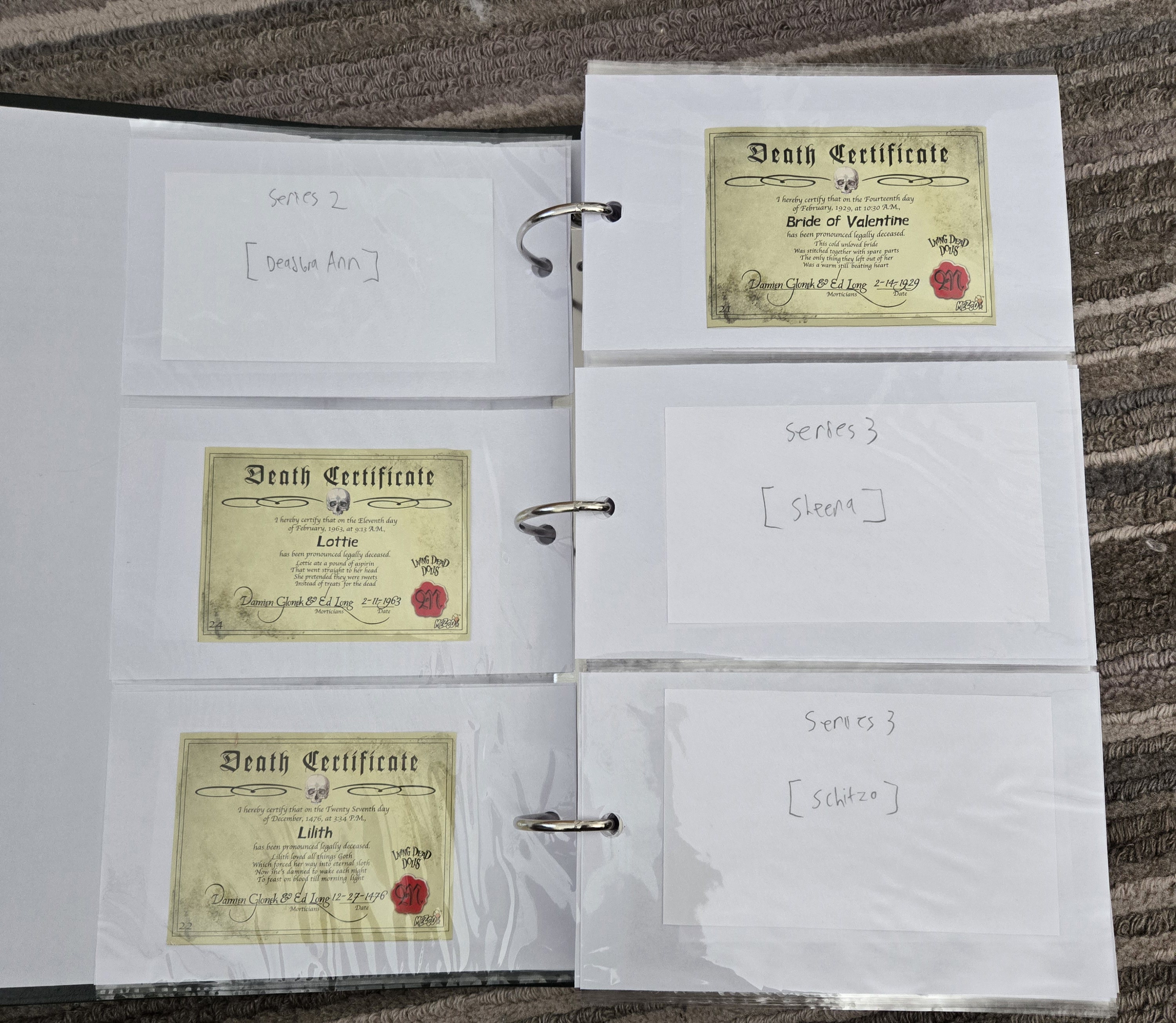
The binder I got has a larger capacity than I'll ever need and 4x6 pockets which fit the certificates horizontally with ample space and vertically, snugly (for those few cases where the certificates are printed that way).
In the binder, I've laid out the doll series in order, and within series, the certificates are filled in the order I got the dolls, which won't always reflect publication date or review order on the blog. There are some series reviews that I want to make where the review order may not be the same as the acquisition order, and maybe some dolls to keep behind the scenes while other dolls from a series are reviewed first despite arriving second. The organization into series doesn't document a full chronological order of when I got the dolls period (e.g., Series 16 Eleanor was collected well before Series 1 Damien), but that full chronological list is written down on a Google doc. The order of the placeholders, save for Series 1 which has been dictated by the Return of the Living Dead Dolls counterparts' release order, is inconsequential and the placeholders can shuffle as they get replaced by real certificates, though I did tend to estimate the hypothetical order of acquisitions by considering how much I like the dolls or when I might plan to get X or Y for a project. Exclusives have their own section after the series, arranged in my collection order, and I also have a section for Resurrection and one for Return, ordered the same way. Blank pages separate series, exclusives, Resurrection, and Return to keep it tidy. Res has numbered series, but because I don't intend to own many Res dolls and they're hard to get as it is, it's not worth organizing them in LDD chronology, nor to save space for each Res doll when very few spaces would ever be filled. I put placeholders in for exclusives with certificates because exclusives are broadly more accessible than most Res dolls and are less of a "dip in once in a blue moon" category, warranting a space for each regardless of my intent to get them. I left space for more Res dolls should they align for me, but not much more. I also didn't save any space for exclusives with no certificates or paper documents akin, like the Lost in Oz dolls, since there's nothing from them to archive through the binder. It just means the binder can't and won't accurately document every single LDD I've gotten unless I decide to go on a graphic-design kick and make my own paper certificates for them. No plans so far.
Here's some pictures of the pages at this stage.


Then I noticed the Series 19 section had only five cards, when, thanks to a variant-exclusive bonus doll, it has six characters. Oops. This forced me to dismantle the layout for everything after Series 19 to reorder the cards properly, and, most painfully, that meant the inserts had to all come out and shuffle because the coloring project was well underway. At the end of it, with the new correct order, I ended up short one dark pink insert for Series 28 and one gold insert for Series 34 each because the new page layout now demanded one more single-sided insert for each. Those two colors needed a revisit. However, all of the near-black inserts I made, for Series 20, 21, 29, and 31, re-allocated perfectly to the new order, with exactly the right amount of single and double-sided inserts to re-fill those series neatly for the revised layout. Math was on my side on that one. I don't remember if the incorrectly-colored Series 13 inserts needed another go after the reshuffle. I repainted them to be accurate later in this process, but I don't remember painting an extra card in the inaccurate first color when I did the reshuffle.
Having placeholders mapping out the series this way is in no way an indication or a pledge that I will ever get those place-held dolls. I expect several placeholder cards to remain there forever, even though I acknowledge the temptation this structure creates to fill every space. I just want an easy place to file certificates, and making it easy meant mapping out the series in static arrangement so it wasn't a tedious shuffle for every new inductee.

Because the binder was thicker than I needed it, and because I wanted the possibility of storing wider pieces from the dolls (i.e., Hazel and Hattie's poster print), I got a new black plastic binder with a thinner spine and a wider measurement so the certificate pages would fit as well as any larger pages I needed.


In the binder, I've laid out the doll series in order, and within series, the certificates are filled in the order I got the dolls, which won't always reflect publication date or review order on the blog. There are some series reviews that I want to make where the review order may not be the same as the acquisition order, and maybe some dolls to keep behind the scenes while other dolls from a series are reviewed first despite arriving second. The organization into series doesn't document a full chronological order of when I got the dolls period (e.g., Series 16 Eleanor was collected well before Series 1 Damien), but that full chronological list is written down on a Google doc. The order of the placeholders, save for Series 1 which has been dictated by the Return of the Living Dead Dolls counterparts' release order, is inconsequential and the placeholders can shuffle as they get replaced by real certificates, though I did tend to estimate the hypothetical order of acquisitions by considering how much I like the dolls or when I might plan to get X or Y for a project. Exclusives have their own section after the series, arranged in my collection order, and I also have a section for Resurrection and one for Return, ordered the same way. Blank pages separate series, exclusives, Resurrection, and Return to keep it tidy. Res has numbered series, but because I don't intend to own many Res dolls and they're hard to get as it is, it's not worth organizing them in LDD chronology, nor to save space for each Res doll when very few spaces would ever be filled. I put placeholders in for exclusives with certificates because exclusives are broadly more accessible than most Res dolls and are less of a "dip in once in a blue moon" category, warranting a space for each regardless of my intent to get them. I left space for more Res dolls should they align for me, but not much more. I also didn't save any space for exclusives with no certificates or paper documents akin, like the Lost in Oz dolls, since there's nothing from them to archive through the binder. It just means the binder can't and won't accurately document every single LDD I've gotten unless I decide to go on a graphic-design kick and make my own paper certificates for them. No plans so far.
Most variant dolls' certificates are unchanged from the mains, so if I only own a variant of a doll with a certificate, their certificate goes in the binder because they count as that doll's representation in my collection. If I have a main and a variant and the two certificates are identical, then I slid the main's into the binder and left the variant's in their coffin. No need to have duplicates.
Here's some pictures of the pages at this stage.
 |
| Photo taken pre-Damien. |
Series 5's variant certificates are unique prints, so I put both of the Vincents' in the binder, which fit side-by-side thanks to their vertical print.

I did end up with a copy of variant Jezebel's certificate, too, but I don't own the doll it came with. I won't put it in the binder because displaying it would misrepresent my collection until such a point as I got the variant (which I have no plans to do). I'm comfortable with potentially keeping and displaying the certificate of a doll that has left my collection, as a memento of having had it, but not in displaying a certificate of a doll I never owned. If I end up dropping dolls and keeping them in the binder, I might have to invest in tiny skull stickers to mark the pages as dolls that left the collection.
EDIT: Once I finally took the step to sell some LDDs for the first time, I made the decision that keeping the certificates was unfair to new buyers, and dishonest for the binder's purpose of reflecting my collection, so I made the compromise to photocopy any certificates of dolls I sell so they'll be in the binder still, but also be marked as lapsed collection members by being cheaper prints on matte paper while the original certificates, flattened, stay with their owners for the buyers' benefit.
While it would be awesome to end up with a binder full of every LDD certificate as an archival piece, this binder is just a document of my collection, and I by no means intend to get every doll that would award me a full certificate archive. A community project to compile every certificate in one source (this thing) would be cool, but isn't my goal right now.
I'm lucky vertical-document Series 5 is seemingly the only release that did alternate certificates for variants, because to display variant certificates for most series would require a separate pocket in the binder and would throw off the whole order. Displaying both the main and the variant certificates for S5 isn't necessary, but because the print orientation allowed it, I did so.
Series 17 has vertical legend scrolls.

Series 24 also has vertical prints.

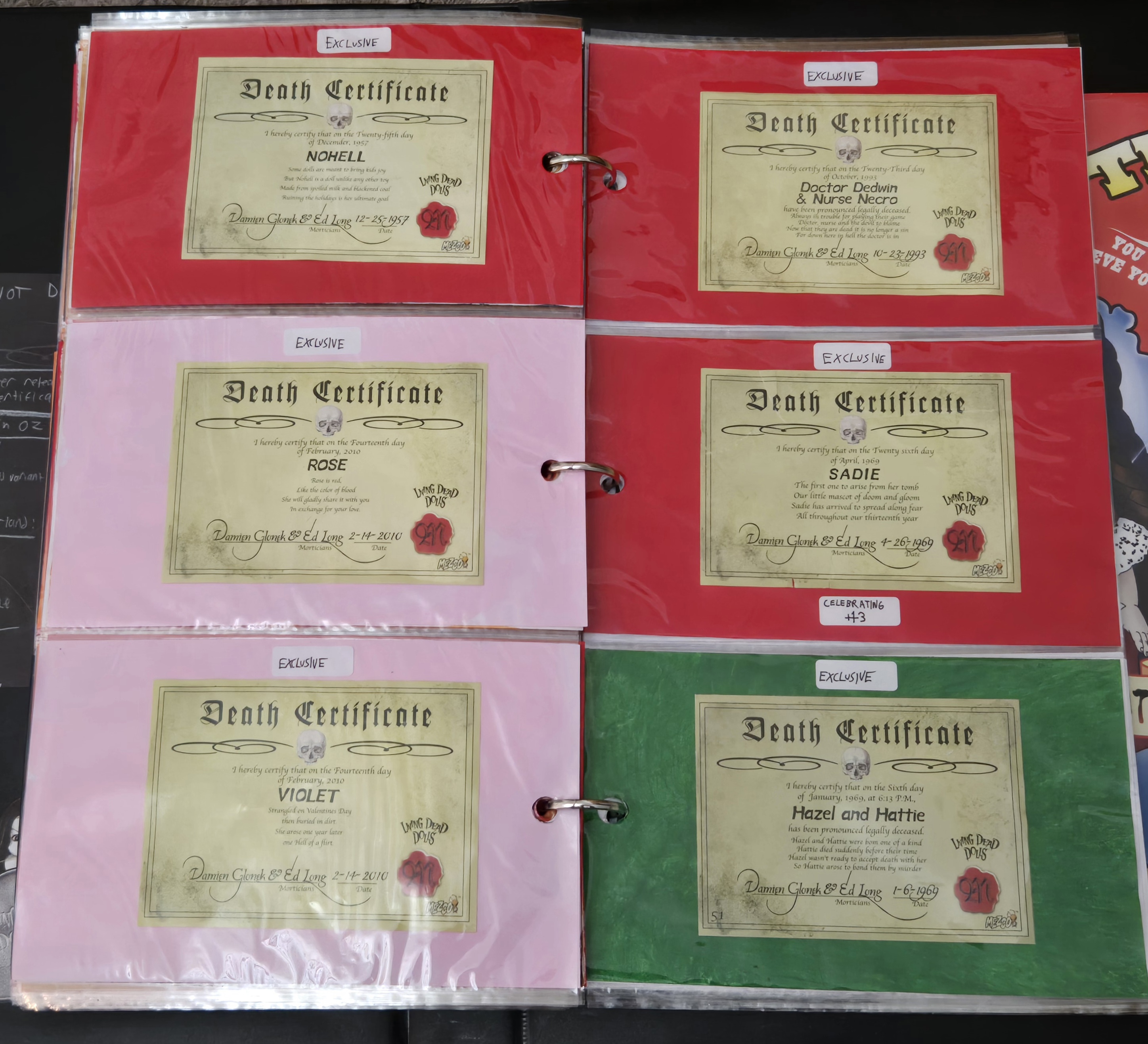
First page of my exclusives, and a good look at the finely-cut tattered flag shape of Captain Bonney's slip.

Resurrections. I have this section because the reprinted certificates are different from the originals--most Res series' certificates recolored the originals white, while Res IX's were just printed in the certificate style of the time, which changed them from the original template. It's worth documenting whenever I get a Res doll, besides, even if the certificate isn't interesting in itself.

Return. It hurt to deprive Sadie's tombstone of its secret compartment's function!
 |
| Photo taken pre-Damien. |
The next thing I decided to start on was coloring the pages' insert cards to match the tissue of the dolls' coffins. This would make it broadly easier to identify which series I was on at a quick flip through the book, even in patches where consecutive series have the same colors.
Because the paper inserts are thin, I doubled up with two inserts per pocket when the doll on one side had a different tissue color from the doll on the other, just to make sure the paint wouldn't bleed and ruin one side of the card. In any case where the tissue color of the dolls on both sides of the binder pocket was the same, I just used one paper insert, painted on both sides. In stretches of consecutive pink (series 1-4), red (Series 9-10, Series 24-27), and black (Series 20-21), double-sided cards saved me several paper inserts, though painting two sides was still as much work as painting two inserts once. Most series ended up with at least one double-sided card when a group crossed between pages of the binder, but some series ended up contained on a two-page spread with single-sided cards all around. The only series that would have been impossible to fit in one spread were Series 7 (seven dolls) and Series 35 (ten dolls with the mystery set considered). Most LDD series are five dolls, while Series 6 is six dolls for its theme and Series 19, 22, and 30 are six dolls thanks to an extra character added into their variant sets. If I mapped out Resurrection series in the binder, they would take less space since their series size is four dolls.
When coloring inserts, I left variant Dahlia's card white because the tissue is white for the variant set of Series 5. If I had main Dahlia as my representative of the doll, I'd have used her certificate and a red card, and if I got both copies, the main doll would supersede and the card would be painted red while both certificates were displayed, like I did for Vincent (despite me favoring his variant). The paint job on the paper inserts wasn't super meticulous--just poured and dabbed/wiped on with a paper towel to cover the surface, and I wasn't aiming for totally flat even color because that was too demanding. I just wanted the color to read and to match the tissue of the dolls, and the tissue itself creates a textured non-flat color, anyhow.
I also went in to make colored cards for the exclusives I had, but spared myself the effort on the exclusives I didn't have, allowing myself to customize the cards if/when I got the dolls. I took the same approach for Series 7, where every doll has their own tissue color. For exclusives and Series 7, those colors get added in when I get the dolls and I know their placement in the binder.
I didn't color the inserts for Resurrection or Return at the moment because those I find those less essential to match to the doll trays. If there's a second wave of Return dolls with a new tray color for the coffins, then I'll get on that, but if it stays red forever or Return stops at Posey, then I won't bother right now. Most Resurrections got red tissue, anyway, making it less meaningful to me to color-code their cards.
For the few tissue colors I couldn't match live but could achieve with the paint I had, I looked at multiple photos to ensure a good coordination--that was what taught me Series 34 had muted golden tissue instead of brown like Series 17's, so I had to mix two colors instead of one for both sets. I was misled by some faded black tissues, though, which aged to look brownish in a way where I painted the cards for Captain Bonney and Series 13 to match the aged tissue I had from them...
 |
| Evangeline's tissue, which was the same color I saw for Captain Bonney. |
...but the color was originally the same as later tissues in the black tone, meaning I'd interpreted one more tissue color in the LDD roster than there actually was.
 |
| My Iris's tissue from the same series as Evangeline is less faded and indicates S13 and Bonney both had the LDD "black" tissue color. |
I went back to repaint those cards later to match the "black tissue" inserts of the rest of the binder.
I got to work on the classic LDD-pink series (1, 2, 3, 4, 6, 8, 12), but the paint I was using ran out and the second bottle was defective, being poorly mixed or something because it was a solid rubbery texture like fidget slime and it pulled out of the bottle as a tube. Unusable. I needed to go get more.
Then I noticed the Series 19 section had only five cards, when, thanks to a variant-exclusive bonus doll, it has six characters. Oops. This forced me to dismantle the layout for everything after Series 19 to reorder the cards properly, and, most painfully, that meant the inserts had to all come out and shuffle because the coloring project was well underway. At the end of it, with the new correct order, I ended up short one dark pink insert for Series 28 and one gold insert for Series 34 each because the new page layout now demanded one more single-sided insert for each. Those two colors needed a revisit. However, all of the near-black inserts I made, for Series 20, 21, 29, and 31, re-allocated perfectly to the new order, with exactly the right amount of single and double-sided inserts to re-fill those series neatly for the revised layout. Math was on my side on that one. I don't remember if the incorrectly-colored Series 13 inserts needed another go after the reshuffle. I repainted them to be accurate later in this process, but I don't remember painting an extra card in the inaccurate first color when I did the reshuffle.
Having placeholders mapping out the series this way is in no way an indication or a pledge that I will ever get those place-held dolls. I expect several placeholder cards to remain there forever, even though I acknowledge the temptation this structure creates to fill every space. I just want an easy place to file certificates, and making it easy meant mapping out the series in static arrangement so it wasn't a tedious shuffle for every new inductee.
Painting all of the inserts was a tedious task which I broke up into sessions so I didn't get bored. I tried to work on one color at a time and knock out smaller sections by color, like all orange cards in a session or two. Red was the most demanding color due to its very common use in LDD coffins, while pink was the second most common, but the red paint itself had better coverage and opacity, making pink more laborious per card than red. Black was the third most common color and was the easiest to paint due to the mixed near-black tone coating the cards quickly with solid color.
This was the cover design I did for the binder, adding the sulfur symbol and text with gold paint pen. The border lines were already there.

This binder turned out to be a placeholder, though.
I also got some small write-on labels with which to mark the series numbers or release formats on each insert. This was helpful for marking switches from one series to another because the tissue colors don't always make that clear, either by having consecutive series with the same color or having the one series (7) with seven different colors. To make the series breaks clearer on the labels, I alternated between red and black ink back and forth for the series, so a change from one series to the next within stretches of pink or red or black would be clearer by the ink color on the labels changing.

Series with certificates that take up too much vertical space have vertical labels.


Series 5's are placed next to the binder rings because if I have a variant and a main and display both certificates (as with Vincent), that's the only spot a label fits in.


Series 35 is kind of two collections--the four standard characters and the six Resurrection-style mystery dolls, so I separated the labels into "SERIES 35" and "SERIES 35 MYSTERY".

Most of the exclusive doll labels aren't marking a special occasion or retailer they're connected to, but I had to put a second label on Celebrating Sadie's page because her certificate doesn't specifically call her Celebrating Sadie, making it harder to remember which release it belongs to at a glance.


For my purposes, I only needed black ink for the labels after the series section of the binder. I didn't need to separate any releases out by switching ink colors. Maybe I will if Return continues and follows a series structure.
I couldn't mark cards for exclusives and Series 7 dolls I didn't have, since their cards needed to be painted first. I kept the labels white on white insert cards even though they're harder to see because there weren't alternate label colors that worked with both red and black ink in the pack I got, and I thought changing the label color for white backgrounds could be misinterpreted as signifying some other piece of information when it'd just be for the visual on the page. All labels being white is consistent. I suppose I could lightly pencil-shade around the edges of the labels on white cards if I wanted to pick out the edges in a subtler way.
The horizontal certificates and Return poems are lightly tacked in with wall-hanging putty so they stay aligned, but the placeholders are loose. The vertical certificates are snug on their own.
Back to the final binder. I ended up using two copies of the same piece, because my first attempt to decorate the binder dissatisfied me and made starting over my best option. The binder is plastic-bound and black, with a label sleeve on the spine, but on both copies, the card dummy inside was so tight that it was impossible to pull out.

On both, I elected to tear the plastic sleeve off the spine, though this was the diverging point. On the first try, I attempted to sand down the spine so I could use it bare, but it didn't hide the indentation from the sleeve being applied, and I tried repainting the covers black to even the finish, and that was overly complicated. Trying to paint a red blood drip design over the cover also looked too messy. With the second binder, I instead glued a piece of cut compressed cardboard over where the sleeve was as a spine detail after painting it.

On both takes, I cut a LDD Minis chipboard down to place on the bottom of the spine so the LDD logo would be on the spine, and I traced a coffin lid for the front after adding a rectangular border, all in silver. In the middle of the coffin, I drew a sulfur symbol and labeled the album's purpose for collecting death certificates. The final wording on this final cover was the best phrasing I landed on to convey context. "DEATH CERTIFICATES" alone on the old binder would get people's eyebrows raised a bit. This new cover provides sufficient context that this is a spooky toy hobbyist album.

All of the red on this binder is with paint pen rather than acrylic paint, just to guarantee consistency. The paint isn't easy to get both smooth and opaque, and I didn't want this binder looking painted with brushstrokes.

Inside the binder, I used some of the stickers from the LDD stationery set, layering the two gravestones over Sin and Eggzorcist stickers so they look like they're popping up behind them, and putting Damien and Sin under the edge of the pockets inside, since the stickers show only their upper bodies.

I declined to use the stickers of Lou Sapphire and Lizzie Borden because I'm not so attached to them and a focus on Series 1 iconography suits the album theming better to me.
The back cover can't accommodate a silver rectangle border like the front cover, thanks to the studs holding in the binder ring bracket, but I still wanted to have something decorating it. I put one of the wax-seal stationery stickers in the corner and freehanded a portrait of Sadie.

I'm actually surprised at just how on-model it turned out for a freehand draw without reference. I know this is a simple doll, but this drawing matches her proportions better than I expected myself.
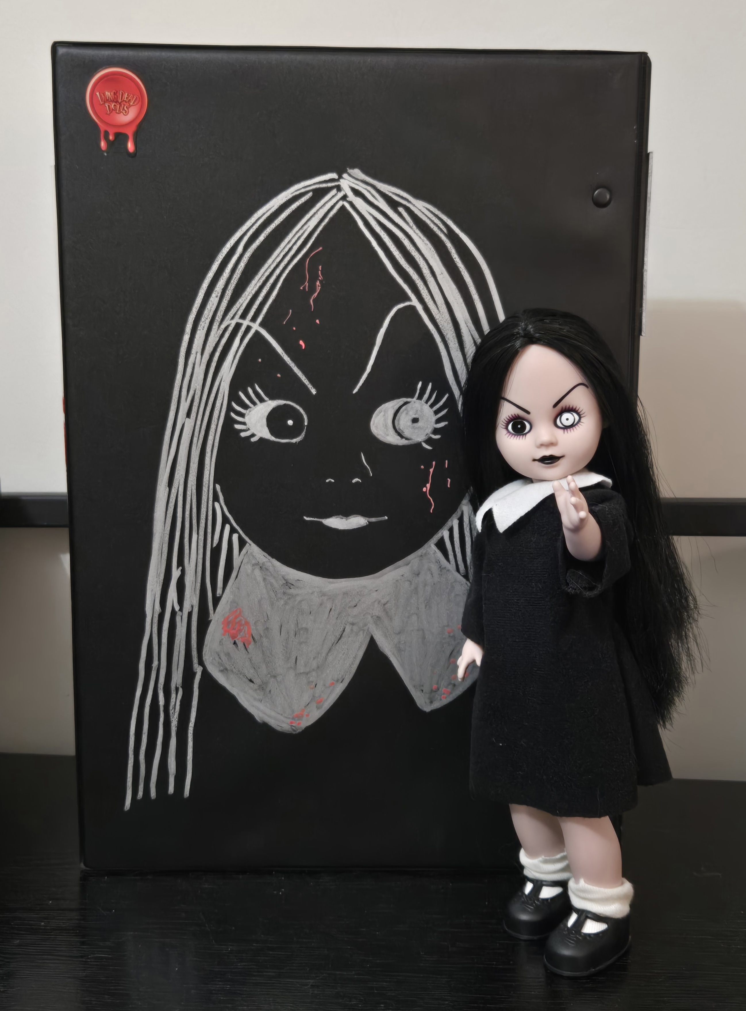 |
| And she couldn't be happier. |
I might have incorporated a ribbon from a death certificate somewhere if I thought I could find a place that looked elegant and appropriate, but I wasn't thinking of anything that worked for me.
I then sprayed it all to seal the piece. I'm quite happy with this result. It was fun using actual LDD paraphernalia to help decorate the book, and while the result isn't pristine and precise, it's better than my first attempt and it looks good. With so much commitment to this hobby and this album, I wanted polish and fun.
When I loaded the new binder with the pages, they really filled the rings, and this piece was almost too thin or small of ring for my needs--very glad it wasn't, after such a successful visual result!
Here's a full flip-through of the pages so my work isn't wasted on my eyes alone. This is a bit of a peek behind the curtain, as this includes some dolls I got and filed in behind the scenes and haven't posted yet: Greed from Series 7 (I honestly can't tell when that review will be published, so zero promises at the moment), Bea Neath and Thump from Series 31 (part of a bigger concept I'm working on), and Ash Lee (Series 34 is not coming anytime soon, like, I'd expect it next year if anything, but she was a productive use of gift money because the project will be made at some point and there were no other LDDs I had in mind which that gift money avenue would cover).


The wider page with the twins' collectible poster is at the very back.

For the earlier binder, I wrote a page on LDD stationery listing the dolls I got which weren't documented in the binder, divided by reason why they're not in the pages:

On the older binder, I had this tacked to the inside cover, but on this one, it goes in a pocket. It's too tall to tack to the section of inside cover above the pocket line.

And that's the FATALogue finished (as a vessel for certificates, at least!)

It is so very pleasing to me to have this place to compile the doll death certificates. It makes them more meaningful collectible pieces this way, as opposed to unrolling them for doll review documentation and then chucking them back into the coffins and doing nothing with them. I never got into any trading card games, but I'm definitely seeing the appeal of card binders, having adapted the concept to LDD. I have old Wacky Packages I might look into bindering up now. They're organized in tied bundles, but an album might be the ticket. It's a very satisfying process to assemble one!
This came out nicely! I bet it took ages, but in a very, type A personality satisfaction kinda way. I wasn't sure why you felt the need to start again just for the poster, but seeing it all together, yeah, the right call!
ReplyDelete