

Valentine season arises again, and my first choice for a topic in 2025 was the Living Dead Dolls Valentine holiday release: a duo of exclusive dolls released individually as the "Twisted Love" duo, being a similarly-styled pair of dolls named Rose and Violet.
While they were one of those exclusive duos not sold as a two-pack, they're one of the duos that works the least if you only have one due to their theming styling them so similarly, their names being part of one phrase, and the two each coming with a chain necklace that can combine into a two-chain necklace with an interlocking pendant.
I didn't adore the doll designs with a passion, particularly not Violet, but I did find them interesting. I liked their concept and necklace gimmick, as well as their special coffins. The best way I found to buy them was to get a set of the two together from one listing. Negotiating prices of them individually and coordinating would have given me a headache, and the listing I chose had both dolls sealed and looking quite manageable in their condition. Some copies of these girls looked like a bigger challenge to primp, and some Roses went overboard with the airbrushed eye shadows in a way I found unacceptable. I got these girls well well within time during December. I didn't want to wait until the start of February to hope they'd arrive and get reviewed quickly enough.
Rose and Violet as Valentine characters are obviously based on the classic cliché opening of a love poem: "Roses are red, violets are blue...". As such, Rose is a creepy girl all in red, and Violet is all in blue. The two wear matching dresses, hairstyles, and bows, but their colors are starkly different, as are their aesthetics--Rose is an edgy "psycho" take on a classic dolly, with dainty lips, shadowed eyes, harsh brows, and blood splatter all over from murders she's evidently committed, while Violet just looks like a very rotten corpse, having an extremely distinctive illustrated/sketchy textured decay design on her face.
It's interesting to me that both dolls are girls in this context. While Rose and Violet are both feminine names that likely dictated the choice, these characters can take on a sapphic tone as love-themed dolls who create a necklace together, and I don't know if that was LDD's intent. There's not a lot of anything I could call queer energy in the brand, though the line isn't blatantly normative. Maitre des Morts in Series 33 is based primarily on Alan Cumming's very queer-toned portrayal of the Emcee in Cabaret, and Flamingo in Series 15 makes some reference to John Waters' cult film Pink Flamingos, so there's some possible acknowledgment of or interest in queer art and culture. You could even even take it down to the unusual factor of LDD being a doll line of majority-female characters conceived and designed by three men, though I don't have any knowledge that they are queer, and I don't speculate on that. It's probably more likely Rose and Violet are meant to be subversions of the sweetsy cherubic children you'd see on classic Valentine cards rather than a depiction of a pair who love each other specifically, but you can still read them as a subversion of heteronormativity.
If these dolls are to be Valentine gifts exchanged between partners, they could make more sense for a sapphic couple. A goth guy could give his goth girlfriend one of the dolls, but I don't know how he'd feel about the matching doll for him being another girl. Then again, "guys who buy dolls" is inherently a demographic that's unlikely to have that kind of stuffy gendered hangup about things (hi), and the head designers of LDD were three men, so it wasn't an issue for them, either. And maybe Rose and Violet were in part for sapphic women to celebrate together with. LDD seems to have a large portion of female fans, likely owing to the toys being dolls and mostly female characters, and so it wouldn't be crazy if the Twisted Love dolls just weren't even considering a male audience and ended up sapphic unintentionally.
Here they are.

I was very surprised to learn that these dolls were factory-packaged wearing their respective necklace chains like jewelry for themselves. It makes sense, but LDD almost always puts accessories with the death certificates in the back. The previous exception would be Gluttony, packaged holding his serrated knife. This is also interesting because the jewelry was designed for the human buyer, so the dolls interacting with it is a surprise.
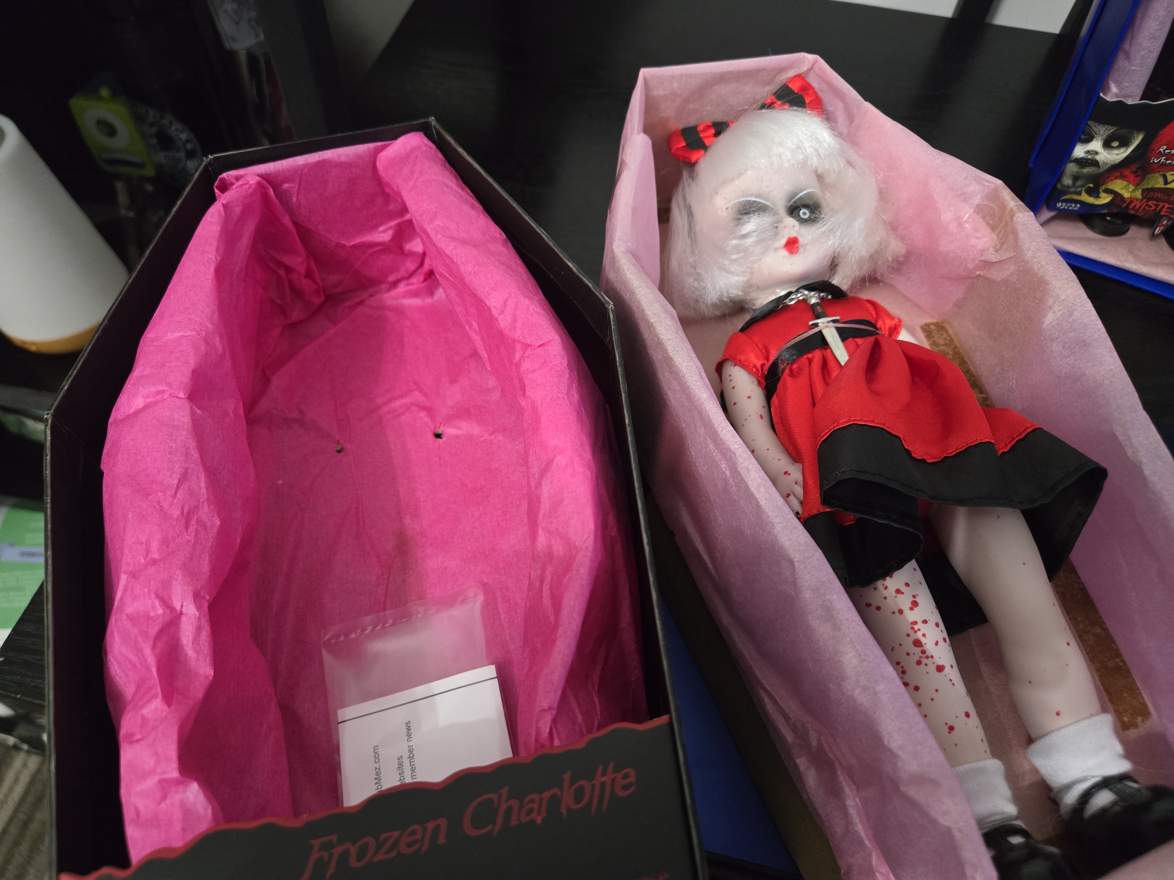
Rose's coffin is a solid primary red color, which would also be used for the Christmas release of the Toy Soldier with a different tissue and different decoration. Violet's coffin is solid primary blue, which is wholly unique to her in the brand.

These dolls thus give me a sample of every LDD solid-color coffin design--black, silver, white, orange, red, and blue.

The white (Nohell) and blue (Violet) are the two solid LDD coffin colors exclusive to a single doll. They're the only two coffins you don't need to put a sticky-note name label on for closed storage! (If you have both Nohell variants, though, then labeling the white coffins would also be helpful. Violet has just the one edition!) The Toy Soldier also used red alongside Rose, Jack O Lantern and Sweet Tooth both used the orange (I have the latter), Series 5 and 25 both used the silver, and black is the majority design for the entire brand. I think the Series 25 silver coffins had black logo print on the cardboard lids, not metallic silver like S5's, but it also may have been silver reflecting something black in the photo I saw.
The backs of the Twisted Love boxes feature mostly black print, but have some yellow and white. Sweet Tooth's orange coffin had entirely black print, even inside the lid. Twisted Love's lid interiors render the art in a lighter shade of the box color, like the black coffins do.

The two dolls have nearly identical chipboards, with only the identifying name differing to suit each character. Their chipboard poem and imagery is designed to include both dolls, and the design would surely look basically identical if they were a two-pack in a double coffin with one chipboard. The center features the image that their jewelry will create when combined, though the heart looks illustrated while the sword appears to be photographic.


I have to wonder if a hypothetical Rose and Violet double coffin would be purple (blending their colors) or a pink (for a general Valentine tone), or if LDD would default to black (the color, I believe, of all LDD double coffins). I can appreciate them being solo dolls just for the fact that we got two divergent coffin colors from them!
Their chipboard poem says:
Rose is blood red,
Violet is cold blue
Revenge can be sweet
When love is not true
Are they vengeful? Do they kill their exes? Are they exes of each other? I don't know. Revenge on an ex is an appealing prospect for many, but it doesn't have a direct explanation as to how the idea pertains to these characters.
Here's a rewrite closer to the classic rhyme.
Rose's blood red
Violet's so blue
Killing is sweet
And so are you.
Their tissue color is a paler pastel pink than the "LDD-pink" tissue color used in several series starting with S1-S4.
 |
| S12 example shown on the left here! |
I think the pale pink works well in both Twisted Love coffins. While solid red and blue matched to their boxes or contrasting tissue matching the opposite character would be more striking, the pink looks really nice. There have been plenty of LDD coffin trays with red tissue matching Rose, though I think the only doll with blue tissue matching Violet is Series 7's Lust, using a tissue color that no full series did (each S7 doll had a different tissue color). Maybe that color overlap is appropriate, given the character, though romance has nothing to do with her!
Rose's certificate names her death date as Valentine's Day (February 14), 2010, which is when these dolls were released.

Her poem says:
Rose is red
Like the color of blood
She will gladly share it with you
In exchange for your love
And a rewrite.
Red, to Rose
Is the color of blood
The passion of romance
She spills to a flood
Here she is unboxed.


Rose's necklace is wrapped around her neck and looped and pulled to shorten it on her torso, and the clasp is closed. An elastic band held it to her torso for packaging. Taken off, the chain is decently long and the pendant is a broadsword with a black hilt and a red carved sulfur symbol within it.

The chain is metal which has slightly oxidized and turned green, while the sword appears to be metal, but is light and not cold. The metal not being treated to prevent oxidation disappoints me, and it was visibly much worse on Violet's. Vinegar will clean it up, but it's a bit shoddy. Rose and Violet weren't sold as high-end dolls, though...unlike Captain Bonney, also a victim of metal oxidation.
Back to Rose.

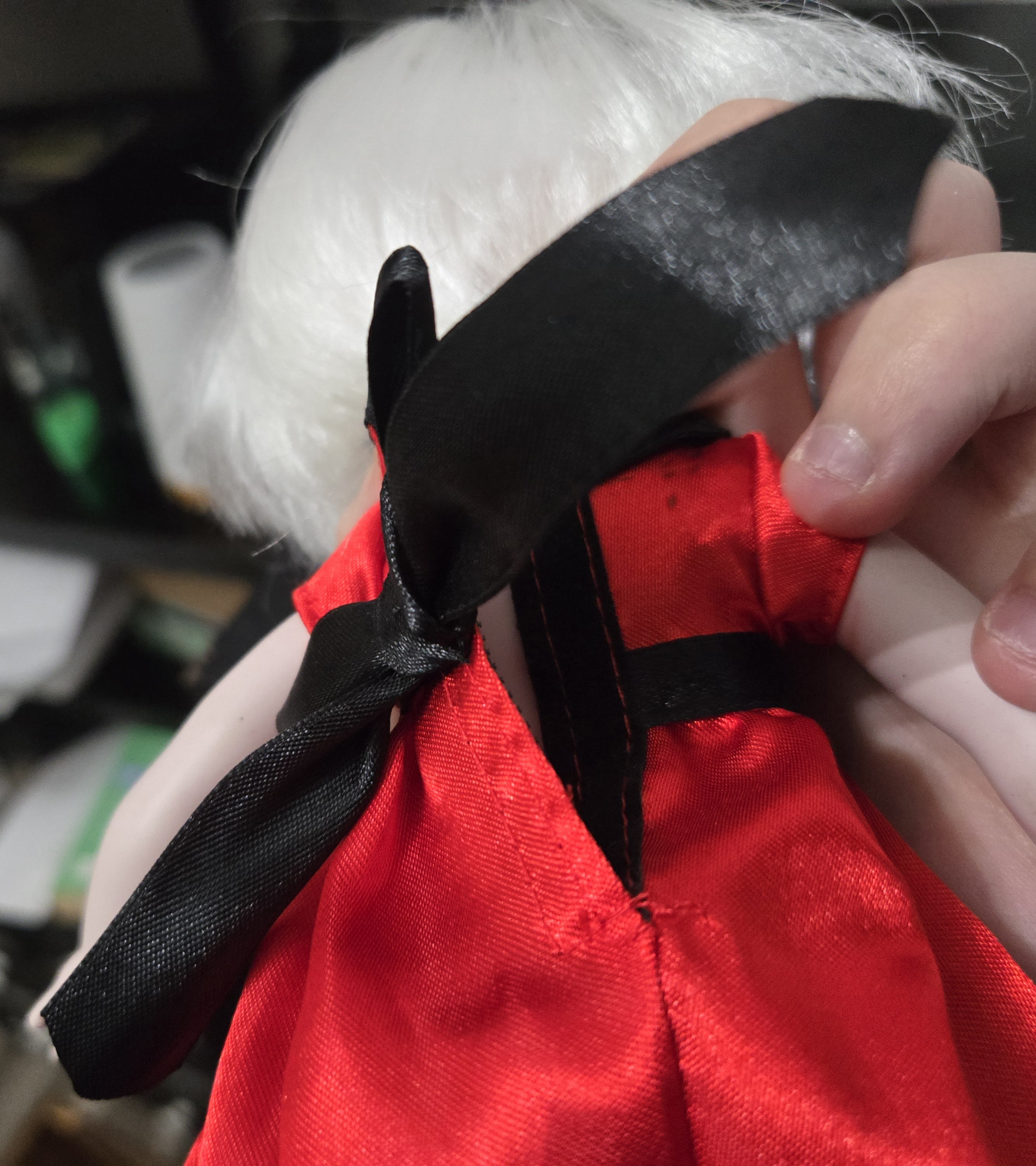
On top of her head, Rose has a striped red-and-black hair bow for a cute retro girlish look. The bow is on a ribbon band with a small elastic section in back to let it stretch a bit, but the piece also has a long velcro closure on the top under the bow as an option.

This was hard to pull off her head, because I realized the velcro strips on the ribbon were secured with a tacky, melty gooey glue that got into Rose's hair. I don't know if this was once solid and it decayed or if it was an adhesive that was never designed to cure solid, but it's gross and horrible.

I know it's hard to use glue and velcro together because if the adhesive soaks into the fuzzy loop strip, it won't work anymore, but why was a velcro closure even needed? Whatever happened to a good-old-fashioned band of fabric elastic as the whole loop? I'll need to Goo Gone treat this hair and rework the bands to pull the velcro off, remove the gunk, and make the bands not an issue.
Rose's hair is a white bob cut with straight bangs which is not rooted very thickly. The fiber doesn't feel too soft or pleasant, either. I'm a huge sucker for edgy scary characters with a red bloody motif that have white hair instead of black, though, so Rose's hair has a lot of aesthetic appeal.
Her face is really striking, with its edgy murder take on a cute dolly.

Rose has vintage tiny-lip paint just in the middle of her mouth making her look dainty, and her eyelashes are sweet, but her eyes are black voids with white irises and red pupils in the middle, her white brows are harshly slanted, and she's spattered with a fine red blood dotting that looks like the paint was blown onto her. Her eye design reminds me a little of Series 1 Sin, and the outlines give her a cartoony charm. Her skin is a very pale flesh tone. Pure white would have been really poppy and striking, but this color suits her really well.
Rose's sclerae and eye shading are all one application of airbrushing, and on my copy, the airbrushing isn't opaque enough to make the sclerae fully black when seen up-close. However, I'll take it over some other Roses I saw while searching that had way too much airbrushing that looked like this and killed the face for me:

The blood splatter is really cool. It's not as drippy and runny as the prototype Rose on the chipboard, but the effect is nice. It looks like she was standing in the gory mist after shoving someone into a wood chipper.

This paint continues onto her limbs, with both sides splattered unlike on her face. The effect is similar to Bloody Mary and Gluttony's splatters, but Mary's didn't get as fine as Rose's, and she had lacerations and drippy blood as a major feature, while Rose is clearly only wearing someone else's blood. Jack the Ripper's original UK-exclusive standalone LDD also had similar blood splatter. I like his design vastly more after just recently learning his hair is salt-and-pepper and not pure black like I had always thought.
Rose's dress is a very simple retro girl's piece with a rounded collar and a waist ribbon and black trim. The dress is all satiny fabric in the two colors of red and black, and the sleeves are not puffed.
 |
| Honestly, dye her hair black and add red horns and a tail, and this is Sin. |
Unfortunately, the collar stained areas of Rose's neck which are visible when her head is lifted.
The giant ribbon on the back of the dress is purely decorative, with the band being split across the velcro seam rather than requiring the bow be untied. I always appreciate when doll dresses do it this way.
The tails of the bow might be a little too long for how stiff the fabric is, so they stick out to the sides. The satin of the dresses is also pretty stiff and can make a crumpling sound when moved. It's not the highest-quality satin LDD has ever used.
Rose has typical LDD socks and very glossy black Mary Janes.

Her fingernails are also painted black.

As expected, Rose's legs are indeed uneven lengths, so a flat-footed stance for her has more sway in the torso than normal.

At least she's a ball-joint LDD whose hips and neck can be adjusted sideways. With swivel Dottie Rose, I didn't have as much flexibility managing the same issue.
Rose's underwear paint matches her dress and is glossy like her shoes.
Now for Violet's look-over.
Violet died the same day as Rose. But boy does she look deader.

Her poem says
Strangled on Valentine's Day
Then buried in dirt
She arose one year later
One Hell of a flirt
I don't feel comfortable calling a childlike doll a "flirt". Violet isn't dressed like a grown woman. How about:
Strangled on Valentine's
Buried in soil
Your heart's pain and sorrow
Her ultimate toil
Here's Vi out. She looks rough on accident in addition to successfully looking rough on purpose with her paint design.

Rather than an elastic holding her necklace to her torso, Violet actually had an additional twist wire which was around her torso and chain only and not connected to the box.
Violet's necklace is entirely metal with a heavier heart-shaped pendant and a carved LDD logo painted in red on the front. Her necklace also had more oxidation.

While the engraved logo is fully painted and untouched, the letters are so thin at points that they can look like they've lost paint.
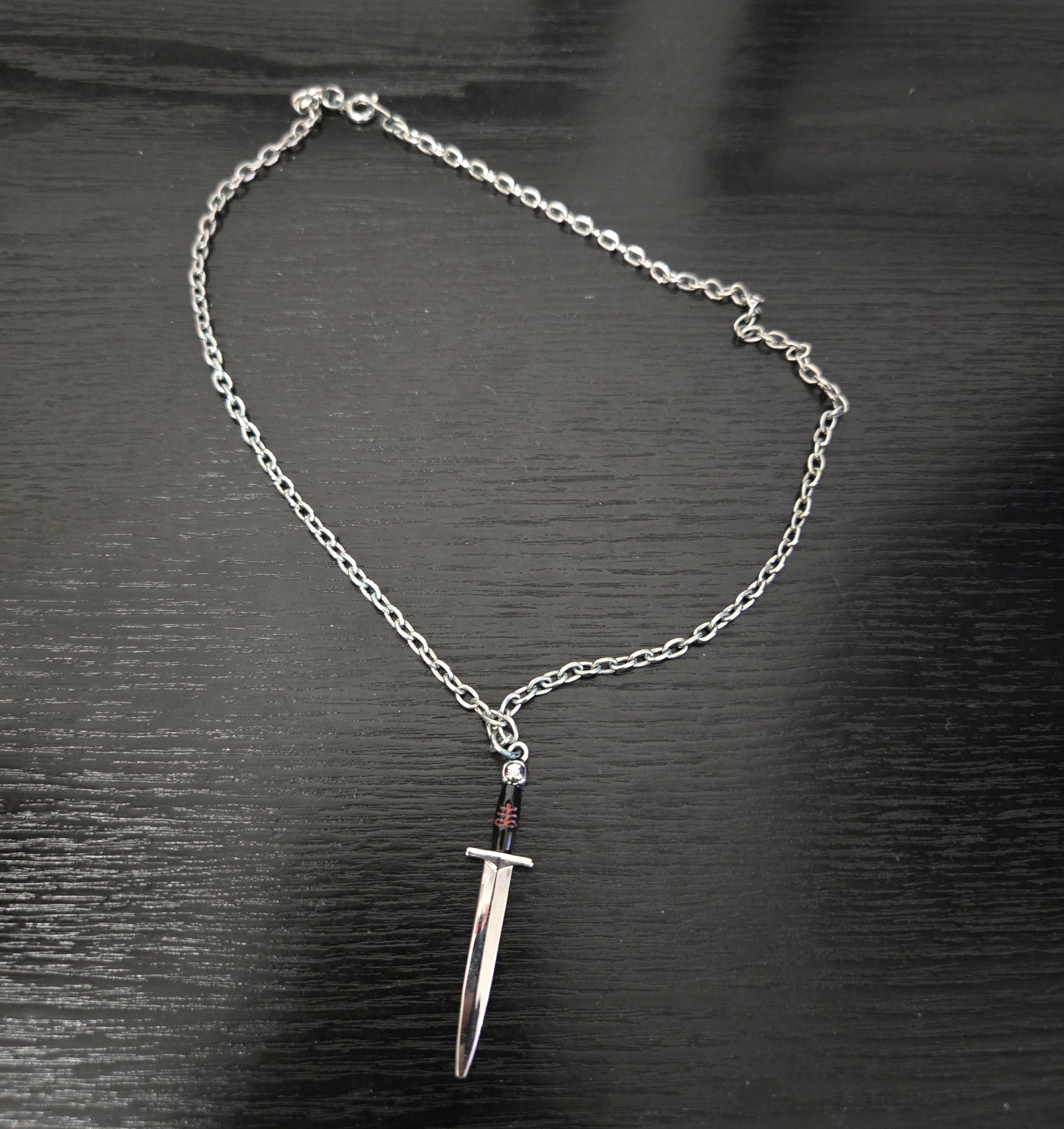
This pendant has a longer chain than Rose's and a rectangular slot right through the middle of the heart which Rose's sword slides into, emerging through the bottom, so you can wear the chains stacked while the heart is run through by the sword.

I like this imagery a lot. Arrows in hearts are brutal in their own right, but they're trite and have lost their sting through their cutesy Valentine ubiquity. A sword through the heart is more distinct and allows the perception of it being an "edgier" take.
The sword does not fit particularly tight inside the heart, and the chains have no spots where they're designed to physically link together in a new structure, so you are just wearing the two chains separate with their pendants slid together without friction, meaning the necklaces could separate if you move quickly and they bounce around. Both pendants being heavy and maybe a magnet inside the heart would have done wonders. I also feel like the LDD logo on the pendant is a little tacky for Valentine's itself, and if I were a necklace-wearer, I'd probably turn the logo side of the pendant to face my body. Wearing the logo as a declaration of fandom and your collection is perfectly valid, but it works better for that purpose than for the holiday out of context. If you want this to be a regular necklace for anybody's company, turn the logo to you.
A black version of this jewelry was also sold separately as a standalone item through a limited Mezco direct release.

Maybe this cheapens Rose and Violet's gimmick a little, but this version of the necklace was actually harder to get due to a very small run, and because it's not identical, I think it's fair game. It almost feels like this exclusive necklace would have been split across a variant pair of Rose and Violet dolls, but maybe Mezco had no good ideas for designing new palettes for them because their color theme was so restrictive and pushed them into one specific look? (An easy way to do variants would just be to swap the hair and dress colors on each.) Or maybe this necklace was always going to be its own thing.
Now to Violet.

I used to be so confused by this doll, but she is such an aesthetic in person. Maybe I'm a sucker for dramatic blues (I am!), but her art design is so weird and so interesting and compelling to me now. Also, she's a little like a morbid Lucy Van Pelt, and I've always had an affection for Lucy, ever since I was a kid.

Violet's hair bow is just like Rose's, except for the blue color, and is gross and goopy like hers too.

Violet's hair is even thinner than Rose's and is obeying no shape right now. It hangs shorter than Rose's and her prototype image, and the hair might not be able to match Rose's length when boiled. Fortunately, I think it's really cute at that length, and it forms its own retro little girl's hairstyle.
Her face is fascinating. While prototype images of Violet emphasized a sketchier thin-line effect to her face, the produced copy looks a lot more chunky-colored and painterly in a way I seriously don't mind.


While the factory rendering seems to have been streamlined and simplified, the look is all there--Violet is extremely cadaverous, with dead white skin, corpse wrinkles and hollows shriveling and sinking her face, zombie eyes, and exposed teeth and hollow cheeks emphasizing a skull shape. Violet's eyes are asymmetrical, with a watery blue eye in a black socket/sclera looking up on her right, and a solid white circle with a slight glowy blur looking forward on her left. Her lips are overdrawn in a grotesque exaggerated frown and her teeth are painted on both lips--on my Violet, the upper teeth are mostly hidden under the curve of the lip.
My favorite detail that ties her together is the hollows in her jaw, which, through two rough-stroked colors alone, evoke holes in the skin and exposed anatomical muscle!
 |
| There is a white ding on this side, though. |
I was not sold on Violet from her prototype images, and other dolls with this style of hollow-jaw skull designs on their face (Resurrection Killbaby, Samhain) did not appeal to me, but I think factory Violet's chunky expressive brushstroke paint style fully sells this for me. She looks like a corpse painted by Picasso, and I mean that in terms of expressionist brushwork, not in terms of having distorted facial placement. I get the idea the Violet that LDD fans got was probably not what her designer(s) fully wanted her to look like, but it's successful to me. She feels very oddly arty in her paint design, and regardless of final execution, it's undeniable Violet is an aesthetic unto her own. That comes through from the original intent.
I discovered a bit later that all of Violet's face is paint, down to the white! Her head cast is a greyish tone that seems like it could be "default" uncolored vinyl, revealed by a blank patch under the back of her hair!

The rest of her body seems to be cast white, so I wonder why her head wasn't. Was a streaky look so important that the head color needed to be white from paint rather than the vinyl? The only other LDD I've seen with undyed-looking vinyl under painted skin was the Tin Man last February, and I only caught it because I modified her to be able to store her heart with a torso door!
 |
| Also something of a Valentine doll, per the LDD character in the Tin Man role. I got her too late for the holiday, though. |
Violet's head cast being separate also is apparent under blacklight, where the UV reacts weakly with a pinkish glow to the white paint on her face, which is different from the blue-white glow of the pale vinyl all of the rest of her body parts are cast in.

Violet's dress is just like Rose's, only blue, and her socks and shoes are the same.
Violet has thorough veining designs on her arms and legs which looked too much like cracks in the prototype images in a way that made her image disjointed--illustrated corpse face and porcelain cracks clashed, but on the produced doll, the veining looks in line with the rendering of the face and reads as cadaverous rather than ceramic. The lines are just blurred and streaky enough to fall in line with Hush's veins more than Evangeline's shatters.

Her fingertips are also smudged with black paint, which is a haunting little detail suggesting grime or dirt in a very stylized way. What's so eerie about Violet is that she's dead and decayed but doesn't feel gory. She seems like a corpse from somewhere cold or wet, but she's not full of blood or bile or fluid, nor is she wounded.
Here's the two dolls undressed.

Violet has glossy undies like Rose in the requisite color. What I like about LDD's duos is that even if costuming ties them together like Rose and Violet's very heavily does here, the base dolls are wildly distinct. The most similar doll bases they've ever done for two characters are Hazel and Hattie, who are conjoined identical twins for whom the "mirror-image" effect is part of the design concept.
The other great thing about Violet is that her paint design perfectly meshes with pigment stains from her costume.
I took the girls down to clean their hair and boil Vi's down into shape, and Goo Gone'd the headbands and removed the velcro pieces and glued the bands into closed loops. When I tried fitting the headbands, though, I was stymied because the only thing keeping them encircling the back of the heads was the hair sticking out of them, leading me to think maybe the melty glue was the only thing really holding the headbands on before. This attachment behind the head instead of under the chin made the pieces too fiddly, and going under the chin didn't look right at all...so I decided to give up on the bands altogether and do something much more efficient and user-friendly--take the stiff black wire I have and bend it into humanlike headbands that slide over the top of the scalp in an arc. The wire holds its shape and slides very neatly and securely onto the dolls, and I only had to thread the wire through the wrap in the middle of the bow to attach it, which also lets me slide it across the band and adjust it for asymmetric wearing.


Simplified and massively more user-friendly at the same time! This is what the design should have been. The ribbons behind the neck that don't stay on securely without the glue leaking from the velcro attachment were very badly over-designed with no benefit.
I also trimmed the tails of their dress bows.
Both dolls' hair turned out pretty messy with lots of flyaways, and Rose's rooting is hard to not see for how thin it is up-close, but Violet's hair sits in a better shape, and both characters have excuses for messy hair--Rose because she's consumed by murder and Violet because she's rotten.
There are actually superficial similarities between Violet and Chloe. Both are pale black-haired (poorly-rooted) girls with a decay theme, bows, and simple color palettes with one saturated tone...but Chloe's face is so gentle and clean and sweet in comparison that they don't pair up exceptionally well.

Rose has a good deal in common with Madame La Mort. Both are bloody murderers with an "unhinged" tone, and have pale skin, dolly lips, white hair and red theming.
 |
| Rose is actually lighter and pinker of skin. Madame is better-made overall. (The razor is my addition.) |
With her bow and platinum bob and dolly lips, I also belatedly began to see some of early Lady Gaga in Rose's design! I'm sure Rose's favorite song is..."Bad Romance!"
I realized the dolls also had a red/blue contrast that reminded me of 3D glasses, though there's no cinema theming to them.


Here's the necklaces cleaned and on a jewelry bust.

I took advantage of January snow to shoot the dolls outdoors. This day of shooting, the snow was very wet and perfect for sculpting, so I buried them and built a wall behind them, showing them holding their necklaces with a rose and knife framing them.


It was very difficult to pose their arms so the necklace(s) would be held up by both and not fall off one or the other's hand. The jewelry is definitely meant to be worn by the dolls or the owner, and not to be a prop accessory for them to hold.
And I put them in the heart dessert stand in an untouched patch of snow.


Here they are holding hands on the snowy background.

The fun of these dolls is that even with the same photo format, matching portraits must still necessarily veer into different photographic aesthetics.
.jpg)

Violet is an extremely difficult doll to decorate for because primary blue is categorically not a Valentine color (nor is any saturated blue tone) and the doll removed from context or her pendant is not clockable as a Valentine doll. As such, I had to play LDD's game and forge a broadened Valentine aesthetic where she fit in, done by squeezing her blues in and modifying Valentine props for her coloring, catering either to spooky grim vintage or bright flat pop. It was fun to expand the holiday design for her sake, though!
Here's a piece with the head photos incorporated side by side:

I also wanted to make physical Valentines of their faces, which took way longer than I expected. Starting with Rose, I tested a digital drawing for the face over a silhouette of the head to achieve a retro flat two-color print look, but it didn't look great and I tried a hand-drawn equivalent before switching back to and refining my first approach. I printed the piece and got a paper doily heart as the backing, but I wanted to paint it black for contrast. Violet's doily would stay white while her piece would have a black background. I repeated the graphic process with her, just using a black base and blue for Violet's linework, and then had to ink over the print because the printer left lines as the piece was chuffed out. Gluing the hearts onto the backing wasn't the cleanest, but using paint effects (opaque red splatter for Rose and watercolor blue stains for Violet) disguised the flaws.

I then wanted to go all-in on a retro 1950s-esque watercolor Valentine to directly link Rose and Violet back to those cutesy-patootsie Valentine toddlers that their look seems to depict.
This idea took forever to pull off. I tried some freehand watercolors citing old Valentines, but the look just wasn't right and the composition was threatened by not having a solid map, so a couple of rounds of that pushed me to get a reference.
I used this photo of an old Valentine as a base to sketch from, since the girl very easily redrew into Rose's design.

Here's the sketch mapping this card to a new scene with Rose and Violet.

Executing the card from here still took ages, however. I first tried tracing over this sketch with watercolor, using my computer as a light box. I got a good rendering of the figures, but then implementing a solid red heart background started undoing the piece. The paint took so long to get opaque and then the figures got tweaked to the point of no longer looking good--I painted the line of Rose's lips lighter than her lipstick, but then darkening the line made the line too thick and I tried to cover it with white like a grin, but didn't like the outcome. I also immediately regretted the use of brown earth in the cemetery setting, since white snow would suit the winter atmosphere and cohere with my live photos of the girls.

I then briefly sidestepped to see if I could render the piece digitally...but without a proper drawing program at the moment, the visual was never going to be as authentic as desired. It demanded a hand-painted execution.
 |
| This was as far as I got. |
So I switched back to one more attempt at the watercolor. I chucked out the giant red heart background shape but the figure composition and rendering ended up basically the same. This time, I made the line between Rose's lips darker so I didn't have to change her expression, and I changed the background to an irregular cutout vertical shape with a solid red heart in the composition bearing the message, left outlined in white for effect. The background became turquoise with white snow, which contrasted the figures well and set a nice wintry atmosphere while also being perfectly retro for the aesthetic. It's not perfect, sure, but it's much cleaner and more on-target. Rose and Violet are holding each other's human hearts, which I think would have been awesome accessories for the dolls--a red copy of the LDD heart for Rose and a blue one for Violet.


It's not printed, but the piece fully reads as a retro Valentine.
I'd been on the lookout for fake flowers depicting violets, but everybody knows the old love poem lied to you and that violets are typically purple...and blue ones that existed would likely be a bit too pale for LDD Violet, so I ultimately decided to craft a blue violet myself with painted fabric cutouts put onto a spare stem so each doll had their flower.


I got a red stripy teapot recently that I thought would fit them, so I tried staging a tableau with it, but was limited by the lack of good stark-white background options. I wanted a flat, poppier visual to go with the patterns of the dolls, but it's honestly easier to slide them into vintage antique-toned tableaux than retro pop. Or at least, retro-pop tableaux are harder to light and photograph.

This setup worked better. Less stark, but effective.


Here's the first arrangement I had planned, which became the cover photo. The big wooden heart of hearts was painted by me for Violet's sake.

The painted Valentine didn't match these photo aesthetics super well, so I tried to find one that would make it fit.

So that's that!
 |
| I've never taken so many potential cover shots for a single review before. |

Rose and Violet are not very high-quality dolls. Their hair is thin and not fantastic, their hair bows were vastly over-engineered to the pure detriment of reliable use and doll care, their necklaces are subject to oxidation, and my Rose has an overlong leg. The dolls are, however, very charming and each delivers a fun unique aesthetic in a retro cute fashion style. I had gone in being sure I'd like Rose more of the two, but I think it's actually Violet who wins. She's so different with her moody painterly corpse face and her colors are great, plus her hair color makes it easier to look past her poor rooting. Rose is a really solid "unhinged killer" doll look, but we've seen so many red, black, and white bloody entries from LDD that she has more to compete with, and as such, I think her quality problems hurt her more than they do for Violet. Violet is marching to an entirely different drumbeat and that counts for a lot against her production deficits. There are better LDDs than Rose with tones like hers, even though her combination is unique and compelling and I do like her. Violet is flawed but unchallenged in whatever it is she's achieved. No other LDD has her palette or her exact art style.
And yes, this is a part 1. I have two more Loving Dead Dolls I want to bring onto the blog this February--one of whom will be my own creation.

As a concept, I like it! I agree, I think the overall look they're going for is vintage Valentine children, and they nail that. I choose to see them as weird little girlfriends, intent or no lol.
ReplyDeleteI think my fav photo is that spiraling arrangement with the flowers.
Они же близняшки, вроде? Если да? То, ахренеть, близняшки - инцестницы
ReplyDeleteNothing says they're twins, though that's one way to view them. They could be friends who dress alike, because they'd be fraternal twins otherwise. Only their outfits fully match them, since even their hairstyles are different shapes. I personally don't think they're intended to be sisters, but there's nothing clear in any direction.
Delete